Dark mode has become one of the most popular personalization settings in the past few years. To be honest, I’m a big fan – You might even call me a Stan for dark mode (lol). I use dark mode with almost every app, device, and website that I frequent but why has it become so popular?
The short answer is demand. The long answer has more to do with a user’s experience on a platform and can be attributed to multiple factors that we won’t get into in this article. Regardless of the reasoning, we know, that almost all large platforms like Instagram, YouTube, Facebook, Twitter, etc. have adopted the feature. It’s become almost standard. However, now comes the question, “How do we add it to our platforms?”
Adding dark mode to a project can seem intimidating. It’s understandable if you are worried about adding a new layer of styles to an already large project but hear me out! It can be easier than you might think and I’ll show you how to get started. In this article I will:
- Outline the concept of Dark Mode and what you will need to consider when adding it as a feature
- Set up and implement an example webpage with Dark Mode
Things to Consider
With the increased popularity of dark mode, devices like computers and smart phones have allowed for it to be applied as a device theme setting. This means that we can determine whether our apps / websites use dark mode based on the user’s theme setting. This helps to ensure that the user receives a consistent theme without having to manually apply the appropriate settings for each app / website.
Ideally we would only ever want dark mode / non-dark mode. However, we still need to consider allowing for users to manually override the system settings. If for example a user prefers dark mode on particular sites but not for their entire system we need to allow for that.
Finally, we need to consider how we are manipulating our element styles to match the theme switches between dark mode and the expected light mode. How to effect the styles without refactoring the entire style system of a project.

Example Setup
For this example we will be working with a website and we will use modern standard HTML, CSS, and JavaScript. We won’t add in any frameworks or libraries yet since it’s always best to start from the core and add layers once we are comfortable with the concept.
HTML
For demonstration purposes we will include a few headers, a paragraph, and a button in our HTML.
<body>
    <h1>Example Header</h1>
    <p>Lorem, ipsum dolor sit amet consectetur adipisicing elit. Esse voluptas aspernatur repellendus amet delectus.</p>
    <h2>Second Header</h2>
    <button>Click Me</button>
</body>
CSS
To start, we will only demonstrate how to apply styles on the body with a dark mode class. We can then use that class to influence all the child elements’ respective styles in dark mode.
body{
    color: black;
    background-color: white;
}

body.dark-mode{
    color: white;
    background-color: black;
}

body.dark-mode button{
    color: white;
    background-color: #222;
}
JavaScript
This is where the magic happens. When we click the dark mode button we can add the dark-mode class to the body element and apply the appropriate styles.
const body = document.querySelector('body')
const darkModeBtn = document.querySelector('#dark-mode-btn')

darkModeBtn.addEventListener('click', toggleDarkMode)

function toggleDarkMode(){
    if(body.classList.contains('dark-mode')){
        body.classList.remove('dark-mode')
    }
    else{
        body.classList.add('dark-mode')
    }
}
How It Works
In the code shown above we can manually apply some dark mode styles to a webpage. This can be considered the simplest form of a dark mode theme but it is lacking quite a bit. For example, the styles don’t persist when we refresh the page and they also don’t automatically change based on our system’s dark mode settings. So although, we have a great starting point, there is still much more work to be done.
Syncing Dark Mode with System Preferences
In modern CSS we are able to apply media queries to our styles. Some of these media queries can be related to the height and width of the user’s screen or in our specific case the user’s color theme preference. CSS has a prefers-color-scheme media feature that we can use to determine if the user has requested a light or dark color theme in the browser or in the operating system. Additionally, we can apply styles or classes based on this setting.
@media (prefers-color-scheme: dark) {
    body{
        color: white;
        background-color: black;
    }
    button{
        color: white;
        background-color: #222;
    }
}

@media (prefers-color-scheme: light) {
    body{
        color: black;
        background-color: white;
    }
    button{
        color: black;
        background-color: grey;
    }
}
Therefore if we were to replace our previous CSS with the CSS directly above we would no longer need to click our button to see a theme change. The dark mode would be set to match our browser’s preferred color scheme setting. Try it out! Change your system’s theme settings and see if the webpage changes to match it. The webpage’s theme should now persist even when you refresh the page or close the browser but now the button is useless… Well let’s sort that out next.
Storing Dark Mode Settings in Device Memory
We now want to combine the manual setting ability of the first method with the automatic theme setting of the second method. We can do this by utilizing the system’s localStorage or sessionStorage. For this example we will use localStorage. The difference between the two is essentially, information stored in localStorage does not expire whereas information stored in sessionStorage does expire when the browser tab / window is closed.
We will use the automatic theme as the default but if the user manually changes the theme we will store that change in the localStorage. Additionally, instead of using the CSS media feature to set our styles, we will return back to using the dark-mode class styles. Although we are not using the media feature in CSS we will use it in our JavaScript code to run our checks alongside the data we will store in our localStorage.
/* light-mode is shared with the default for the site*/
body, body.light-mode{
    color: black;
    background-color: white;
}

body.dark-mode{
    color: white;
    background-color: black;
}

body.dark-mode button{
    color: white;
    background-color: #222;
}
Alright, so that was a mouthful but let’s get started. The first thing we need to look at is the logic diagram. It highlights the thought process when loading the theme for the website. We have a priority list for our theme data.
- Check for a localStorage theme value (override)
- Check for a system theme value (preference)
- Load styles you have for the website (default)
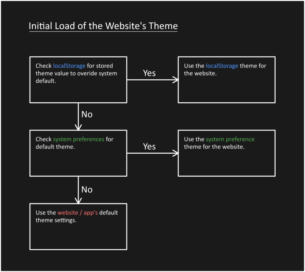
This process can be seen in our initTheme function which we run once the DOMContent is finished loading on the webpage.
const body = document.querySelector('body')

window.addEventListener('DOMContentLoaded', initTheme)

function initTheme(){
    //check if we have a stored theme in localStorage
    if(localStorage.theme){
        const theme = localStorage.theme === 'dark' ? 'dark-mode' : 'light-mode'
        body.classList.add(theme)
    }else{
        //check for the default system theme
        const theme = mql_dark_theme.matches ? 'dark-mode' : 'light-mode'
        body.classList.add(theme)
    }
}
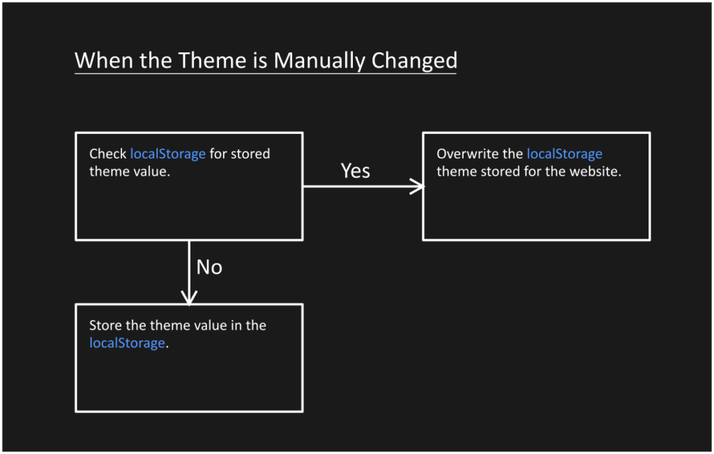
Next we need to allow for the manual changing of the theme. We accomplish this by only looking at and changing the localStorage.theme property inside our toggleDarkMode function. Additionally we add the corresponding dark-mode class to our body element just like we did in our initial method.
const darkModeBtn = document.querySelector('#dark-mode-btn')

darkModeBtn.addEventListener('click', toggleDarkMode)

function toggleDarkMode(){
    if(body.classList.contains('dark-mode')){
        body.classList.remove('dark-mode')
        localStorage.theme = 'light'
    }
    else{
        body.classList.add('dark-mode')
        localStorage.theme = 'dark'
    }
}
That’s all there is to it. So below you can see the full JavaScript code.
const body = document.querySelector('body')
window.addEventListener('DOMContentLoaded', initTheme)

const darkModeBtn = document.querySelector('#dark-mode-btn')
darkModeBtn.addEventListener('click', toggleDarkMode)

const mql_dark_theme = window.matchMedia('(prefers-color-scheme: dark)')
mql_dark_theme.addEventListener('change', initTheme)


function toggleDarkMode(){
    if(body.classList.contains('dark-mode')){
        body.classList.remove('dark-mode')
        localStorage.theme = 'light'
    }
    else{
        body.classList.add('dark-mode')
        localStorage.theme = 'dark'
    }
}

function initTheme(){
    //check if we have a stored theme in localStorage
    if(localStorage.theme){
        const theme = localStorage.theme === 'dark' ? 'dark-mode' : 'light-mode'
        body.classList.add(theme)
    }else{
        //check for the default system theme
        const theme = mql_dark_theme.matches ? 'dark-mode' : 'light-mode'
        body.classList.add(theme)
    }
}
Improvements
Now that we have covered the core concepts we can talk about some areas of improvements.
Using a CSS pre-compiler Like SASS / SCSS
If you want to make your life easier while styling for your themes I would highly recommended using a CSS pre-compiler like Sass. It makes things much more efficient with the nesting feature for child elements. Here’s an example.
/* SASS / SCSS */
body.dark-mode{
    color: white;
    background-color: black;

    button{
        color: white;
        background-color: #222;
    }
}
Let’s add a cool toggle switch instead of a plain button
Many websites offer different variations on the buttons used to switch between light mode and dark mode. We won’t get into that here but you can find some great examples on CodePen.
Let’s talk about Color Contrasts and Accessibility.
Another important topic to consider when selecting your colors is the level of contrast between your background and foreground colors. To make your website accessible be sure to use colors that adequately meet the contrast requirements for your colors. You can check out this contrast checker to see if your colors meet the requirements.
Final Thoughts
Let me know if I missed anything. I would love to hear from you if this has helped in any way. Cheers and see you next time! 🙂