I watched the last sections of the React tutorial video where they covered a notes app and a Tenzies game. The notes app seemed really interesting but I also wanted to try and build it as a full stack project with a database and API calls. So I figure I should wait until I get through the “Odin Project” Full Stack material. Hopefully things go smooth and I can take something away from it. The Front end course was a great review tool so this Full Stack course might help me fill the gaps in my knowledge. Back end work is still somewhat intimidating to me even though I do it when I need to. Ultimately, I don’t want to “just get by” I want to master the space in which I work. I feel like I am getting there with Front-end but Back-end is a lot more difficult.
TLDR;
Okay, so here are the highlights of what I did:
- HTML -> Reviewed
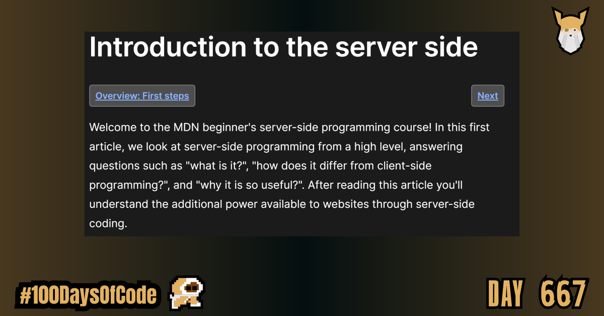
HTMLform elements. It brought back memories of building my first contact form and trying to handle it inPHPto send myself an email. That was an experience. I somewhat miss that rag tag coding lifestyle. Whatever it took LOL. - Back End -> Started reading the MDN docs on Server-side Programming. I have to start somewhere. There is going to be a lot of reading and notes ahead. Here we go!!
- Practice -> Finished watching the React tutorial course. I still need to finish the last two projects but I the hallmark Notes app is something I want to make Full stack so I will leave alone for now. The “Tenzies Game” did not interest me as much tbh so I left it alone. There was also a quiz app that I could do as well. So much to do, so little time.
Rough Notes on HTML Form Elements
Form Input Types
Text Input
Default input type.
<input type='text' />
Email Input
Email inputs are specialized text inputs just for email addresses. They are different from text inputs in that they will display a different keyboard which will include the @ symbol on mobile devices to make entering email addresses easier.
They also validate that the user has entered a correctly formatted email address, but there will be more on validations later.
To create an email input, we use an input element with type attribute of “email”:
<label for="user_email">Email Address:</label>
<input type="email" id="user_email" name="email" placeholder="you@example.com">
Password Input
Password inputs are another specialized text input. They differ from regular text inputs in that they mask the inputted data with asterisks to prevent anyone from seeing what has been entered.
A password input can be created using an input element with a type of “password”:
<label for="user_password">Password:</label>
<input type="password" id="user_password" name="password">
Number input
The number input only accepts number values and ignores any other characters the user tries to enter.
We create a number input using the input element with a type attribute of “number”:
<label for="amount">Amount:</label>
<input type="number" id="amount" name="amount">
Date Input
To collect dates from a user, we can use a date input. This input is unique because it provides a better user experience for choosing dates by rendering a simple date picker calendar.
To create a date input, we use the input element with a type attribute of “date”:
<label for="dob">Date of Birth:</label>
<input type="date" id="dob" name="dob">
Text Area
The text area element provides an input box that can accept text that spans multiple lines like user comments and reviews. It can also be resized by clicking and dragging the bottom right corner to make it bigger or smaller.
To create a text area, we use the <textarea> element:
<textarea></textarea>
Unlike input elements, Textarea elements do have a closing tag. This allows you to wrap some initial content you want the text area to display:
<textarea>Some initial content</textarea>
Text area elements accept a couple of unique attributes that other form controls do not. These are the rows and cols attributes. They allow you to control the initial height(rows) and width(cols) of the text area:
<textarea rows="20" cols="60"></textarea>
Selection Input
Radio Input
Select dropdowns are great for saving space on the page when we have an extensive list of options we want users to choose from. However, when we have a smaller list of 5 or fewer options to choose from, it is often a better user experience to have them displayed on the page instead of hidden behind a dropdown.
In this case, we can use radio buttons. Radio buttons allow us to create multiple options that the user can choose one of. To create radio buttons, we use the ever adaptable input element again with a type attribute of “radio”:
<h1>Ticket Type</h1>
<div>
  <input type="radio" id="child" name="ticket_type" value="child">
  <label for="child">Child</label>
</div>

<div>
  <input type="radio" id="adult" name="ticket_type" value="adult">
  <label for="adult">Adult</label>
</div>

<div>
  <input type="radio" id="senior" name="ticket_type" value="senior">
  <label for="senior">Senior</label>
</div>
We can set the default selected radio button by adding the checked attribute to it:
<h1>Ticket Type</h1>
<div>
  <input type="radio" id="child" name="ticket_type" value="child">
  <label for="child">Child</label>
</div>

<div>
  <input type="radio" id="adult" name="ticket_type" value="adult" checked>
  <label for="adult">Adult</label>
</div>

<div>
  <input type="radio" id="senior" name="ticket_type" value="senior">
  <label for="senior">Senior</label>
</div>
Checkboxes
Checkboxes are similar to radio buttons in that they allow users to choose from a set of predefined options. But unlike radio buttons, they allow multiple options to be selected at once.
To create a checkbox, we use the input element with a type attribute of “checkbox”:
<h1>Pizza Toppings</h1>

<div>
  <input type="checkbox" id="sausage" name="topping" value="sausage">
  <label for="sausage">Sausage</label>
</div>

<div>
  <input type="checkbox" id="onions" name="topping" value="onions">
  <label for="onions">Onions</label>
</div>

<div>
  <input type="checkbox" id="pepperoni" name="topping" value="pepperoni">
  <label for="pepperoni">Pepperoni</label>
</div>

<div>
  <input type="checkbox" id="mushrooms" name="topping" value="mushrooms">
  <label for="mushrooms">Mushrooms</label>
</div>
We can also have a single checkbox when we want users to toggle if they want something to be true or false. Like signing up to a newsletter when they create an account for example:
<div>
  <input type="checkbox" id="newsletter" name="news_letter">
  <label for="newsletter">Send me the news letter</label>
</div>
We can set checkboxes to be checked by default on page load by giving them a checked attribute:
<div>
  <input type="checkbox" id="newsletter" name="news_letter" checked>
  <label for="newsletter">Send me the news letter</label>
</div>
Buttons
Submit Button
Reset Button
Generic Button
Organizing forms
Fieldset element
The fieldset element is a container element that allows us to group related form inputs into one logical unit.
Legend Element
The legend element is used to give field sets a heading or caption so the user can see what a grouping of inputs is for.
To create a legend, we use the <legend> element with the text we want to display within its opening and closing tags. A legend should always come right after an opening fieldset tag:
<fieldset>
  <legend>Contact Details</legend>

  <label for="name">Name:</label>
  <input type="text" id="name" name="name">

  <label for="phone_number">Phone Number:</label>
  <input type="tel" id="phone_number" name="phone_number">

  <label for="email">Email:</label>
  <input type="email" id="email" name="email">
</fieldset>

<fieldset>
  <legend>Delivery Details</legend>

  <label for="street_address">Street Address:</label>
  <input type="text" id="street_address" name="street_address">

  <label for="city">City:</label>
  <input type="text" id="city" name="city">

  <label for="zip_code">Zip Code:</label>
  <input type="text" id="zip_code" name="zip_code">
</fieldset>
Styling Forms
Tricky and downright impossible to style form controls
Text-based form controls like text, email, password and text areas are reasonably straightforward to style. They operate like any other HTML element, and most CSS properties can be used on them.
Things get more tricky when creating custom styles for radio buttons and checkboxes. But there are many guides out there you can use to achieve your desired design. There have also been new CSS properties made available in recent times to make styling radio buttons and checkboxes much easier.
Certain aspects of other elements are downright impossible to style, for example, calendar or date pickers. If we want custom styles for these, we will have to build custom form controls with JavaScript or use one of the many JavaScript libraries that provide us with ready-made solutions.
Goal For Round 7 of the #100DaysofCode Challenge
This is my seventh round of the “#100daysofcode” challenge. I will be continuing my work from round five and round six into round seven. I am currently working through the book “Cracking the Coding Interview” by Gayle Laakmann McDowell. My goal is to become more familiar with algorithms and data structures. This goal was derived from my goal to better understand operating systems and key programs that I use in the terminal regularly e.g. Git. This goal was in turn derived from my desire to better understand the fundamental tools used for coding outside of popular GUIs. This in turn was derived from my desire to be a better back-end developer.
I have no idea if my path is correct but I am walking down this road anyways. Worst case scenario I learn a whole bunch of stuff that will help me out on my own personal projects.